takowana county
Level designer | Game designer
In September 2018 I was brought on to Takowana County, a 3-semester student project, as the level designer. Gaining inspiration from other games like Firewatch, Miasmata, and Paratopic, we wanted to create a narrative heavy exploration game with a sprinkle of Lovecraftian horror. Utilizing a hub-and-spoke approach to the level, this resulted in a small forested peninsula with the player’s homebase, their cabin, in the center of five primary locations.
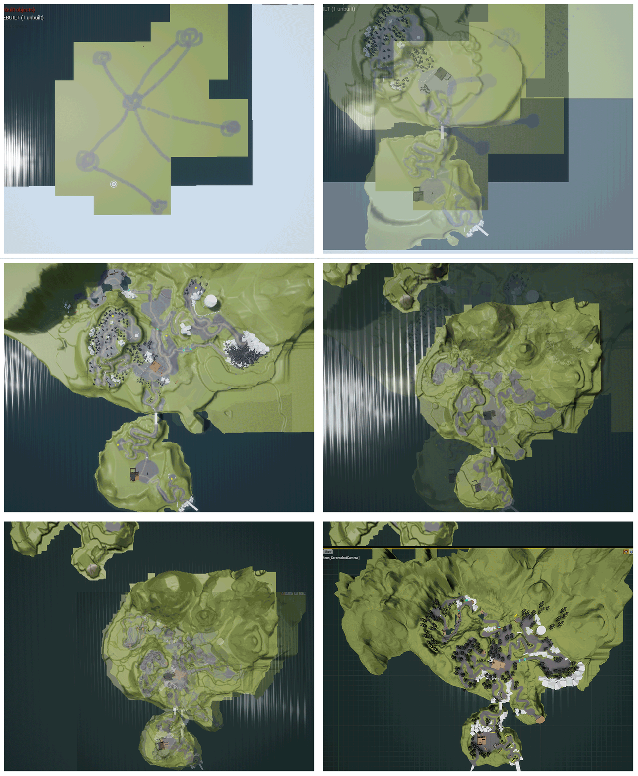
I was brought on during the last leg of the project and my main task was to make the level SMALLER. The original level had over 10 minutes of no-content walking. The level was too large for players, they would get lost, frustrated, and needed help through the game. It was also too large for the team’s art, design, and tech resources.
My initial whitebox cut that time down to 5 minutes, then I finalized the layout to create a walkthrough in 2.5 minutes. While keeping the integrity of the narrative, the level now guides players through the different beats of the story’s structure and amplifies the exploration the player can partake in.
The following is my process in designing this level.
STEP 1: LEVEL FLOW
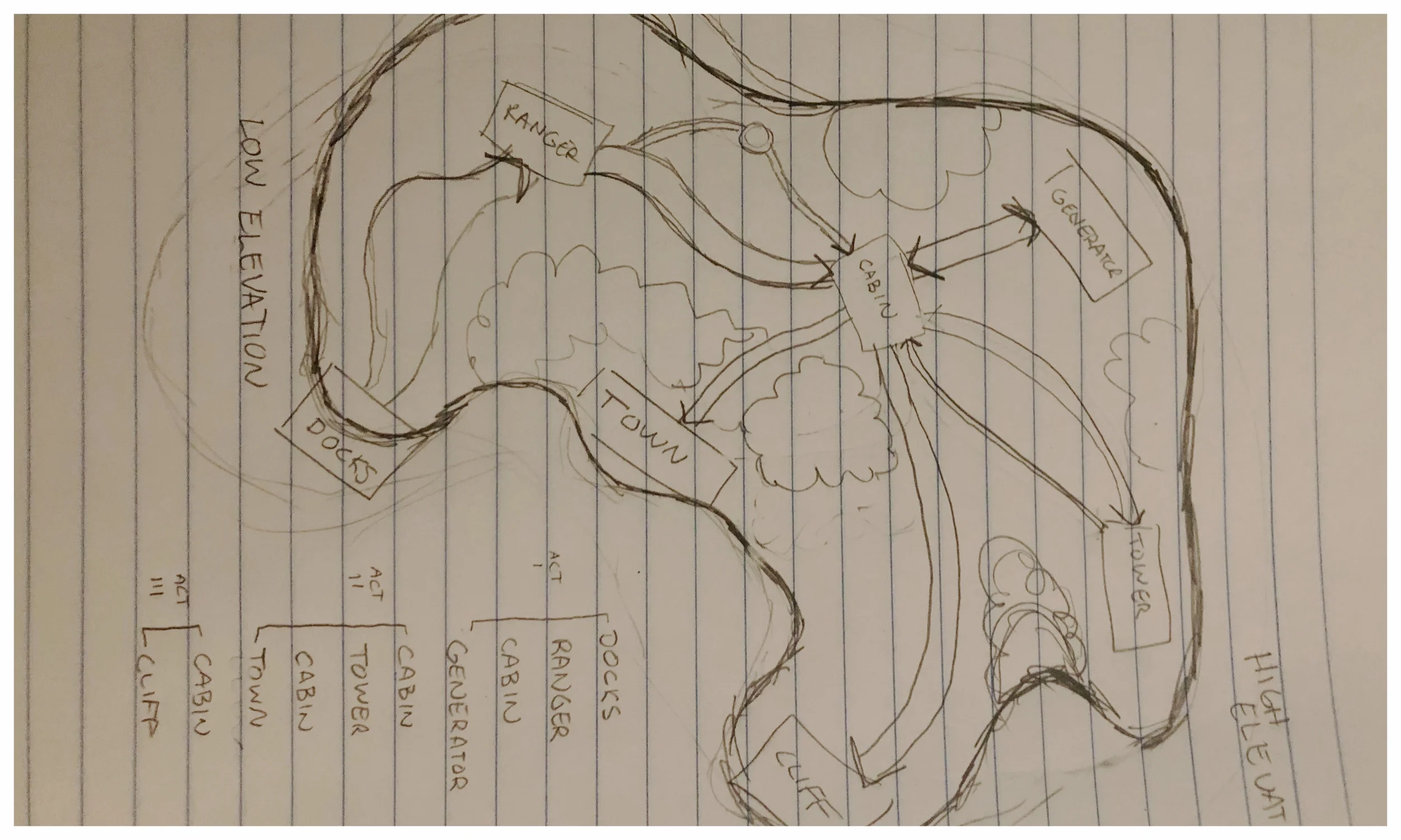
Because the game already had the mechanics, controller, and narrative arc I was able to begin the process by utilizing a node based approach to the level, also known as molecule design.
I mapped out the major locations of the level and drew their connections, or edges. Here, the width and length of an edge determines the distance and directness of the path. For example, between the dock and ranger station is a short, direct path. The arrows at the end of the edge represent one or both way paths.
STEP 2: FIND REFERENCES
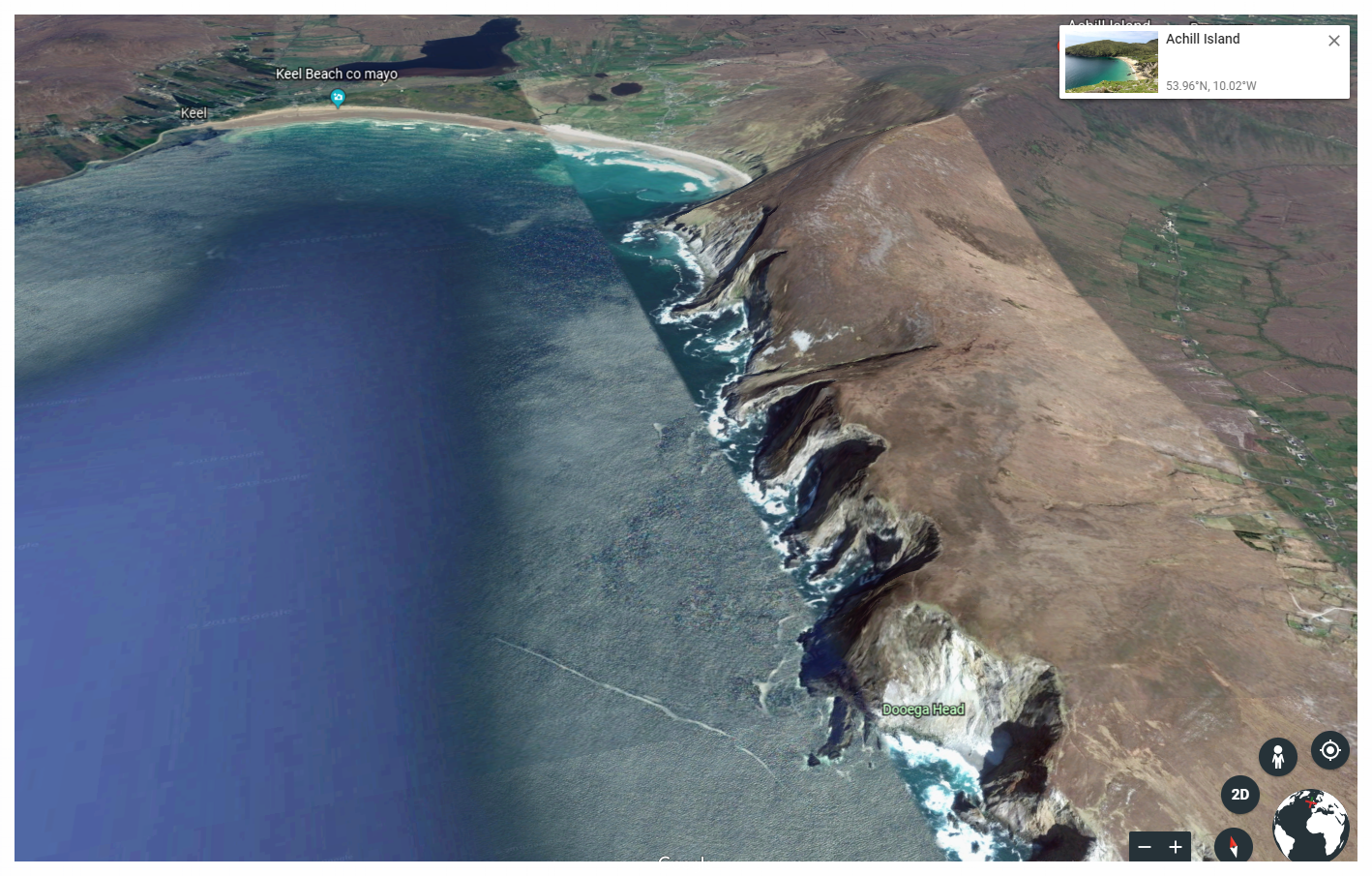
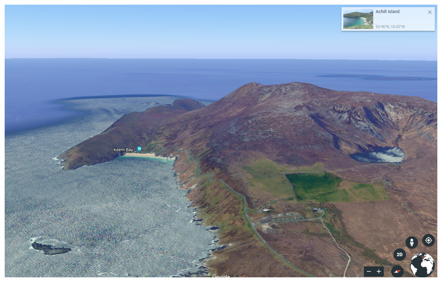
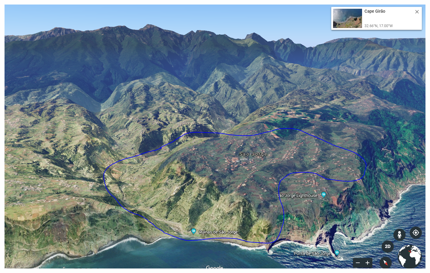
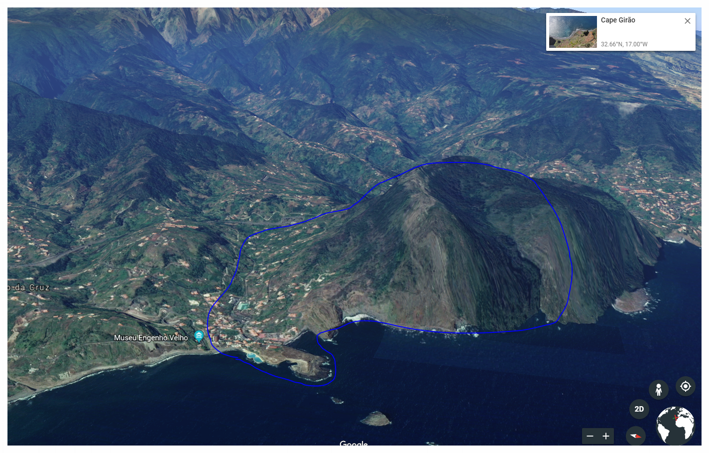
Creating an engaging level that is also immersive and believable is a lot easier when you find real examples in the world. Having access to tools like Google Maps or Google Earth makes this a lot easier.
I found coast lines and peninsulas that have mountains and forested terrain from around the world and used these to inspire the geography of my level.
STEP 3: PAPER OUTLINE
After finding references I went and drew a quick and rough paper version of the map. I used the node based level flow from earlier and blocked out the general area and forms of the level.
I knew that this map would change and morph, but it was a good starting block. With this drawing, it was quick for me to jump into white boxing in Unreal Engine 4.
STEP 4: WHITEBOX TERRAIN
This could be considered several steps over the course of 3 weeks, but it was all a part of the same process: Whiteboxing. I used Unreal Engine 4’s terrain tool to block out shapes geographically and drew expected walking paths of the player. During all of this I was constantly playtesting, and comparing times for walking through the level.
One of the biggest changes thus far was scaling my original sized terrain down by 50% after blocking it out. I had to go through and rework some of the switchbacks and walking paths but it made the level tighter, players kept interested, and it was more manageable for the team.
STEP 5: COMPOSITION PASS
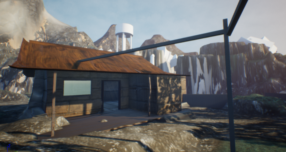
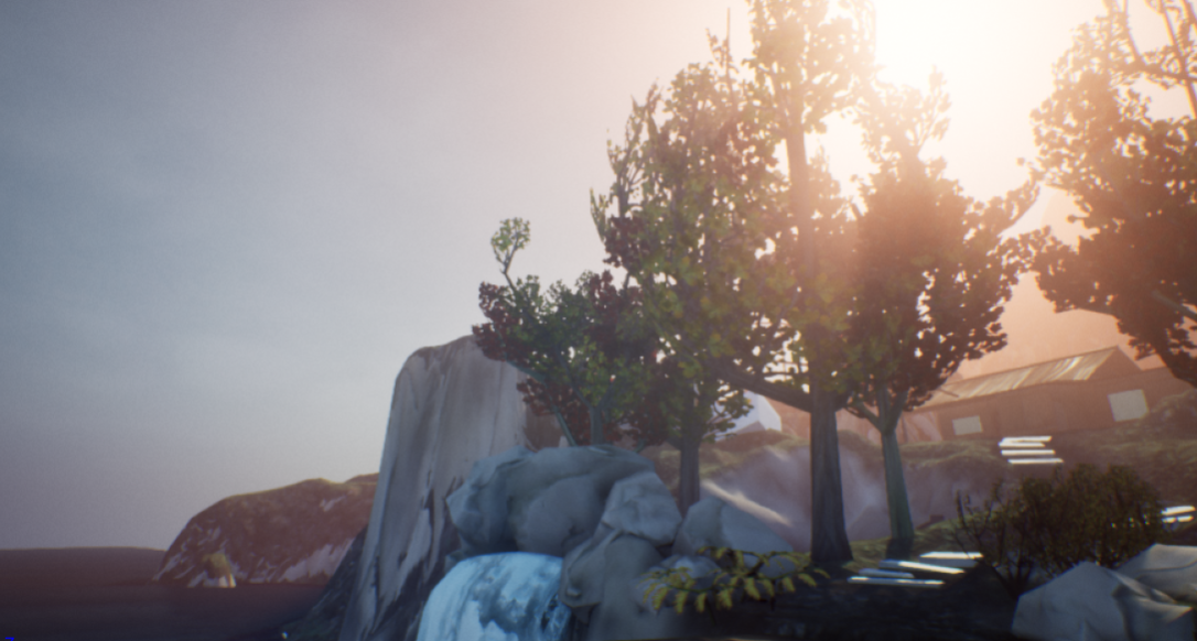
Before getting the whitebox into the level and filling it with the art assets for the game. I used primitive shapes to block out how I wanted locations to look. Using basic rules of compositions such as rule-of-thirds and for, mid, and background, I composed scenes as the player walks through the level.
These images were from the final stages of the whitebox level before porting it into the game project.
STEP 6: CONTINUE WORK
From Sept-Dec 2018 I continued work on the game and level in engine. Placing art assets, recreating compositions created during whiteboxing, softening the terrain, and ways to break up the horizon lines. It is all about making tweaks to get the perfect feel as the player walks through the level.
SIZE COMPARISON
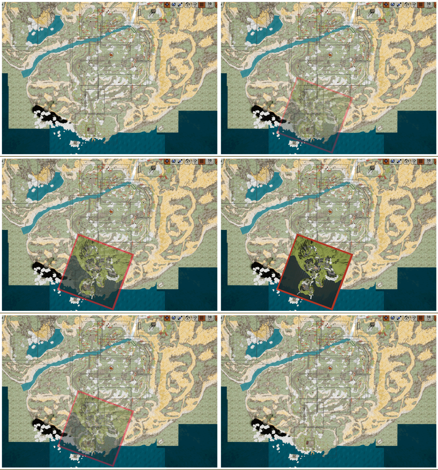
The overlaid map is my whitebox in comparison to the original level.


