Ancient Chinese Courtyard

TThis is a floorplan, side elevation, and front elevation of a Courtyard Family Unit I created in 3-days. It was based off of ancient Chinese architecture focusing on the connection between interior and exterior spaces, curved eaves, and brightly colored timber.

The floorplan was created for a wealthy or high-class family and two middle-class families. The 7 small statues on the tops of the golden-roofed house are signify that the family living there is significant. There is a courtyard outside in the center and directly off of it is the kitchen and dining area.


REFERENCES

Here were a few of my references I used while researching and a very helpful website explaining the architecture of ancient Chinese houses:

http://depts.washington.edu/chinaciv/3intrhme.htm


CourtyardUnit_ref2.jpg
 

Mayan CitY

This is a 2-day sketch, digital clean-up, and 3D model of an ancient Mayan city plan that I made. Chicha Itza was my main reference, however I also looked at cities like Tikal, Becan, and Yaxha.

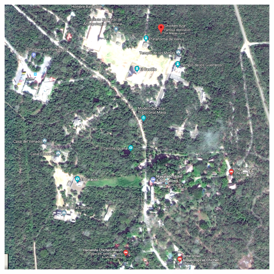
Chicha Itza is one of the most visited sites in Mexico and has plenty of reference images and analysis for me to use in my approach to the design. In the time I had, I knew I wouldn't be able to create a city of this scale, so I needed to create the same flow and feel of the city in a much smaller space.

One of the challenges I faced creating this map was quite literally "thinking outside the box". Grids are a very easy go-to for creating levels and maps. Mayan cities however are sporadic, following the flow of the land and the path of the sun on important calendar years.

 
My final 3D blockout of the Mayan City.

My final 3D blockout of the Mayan City.


REFERENCES AND PAPER MAPS


ROMAN LEVEL

This was a 1-day level design sketch. It is a top-down level where the player would be sneaking around a the ruins of a guarded Roman City taking pictures and collecting parts to take to the basilica at the end.

Overall I wanted the player to explore areas without requiring them to. This is why there are so many photo opportunities throughout the map. The two interior areas, Bathhouse and Basilica, give the player more confined and guided areas to move through.

In general the feel and flow is where I wanted it to be, but without conducting full playtests or having more time, the actual arrangement and paths are not as tight as they could be! I would continue developing the guarded pathways, the intro area which is currently pretty flat and boring as-is, and I want to create more variance in the areas the player is in, right now there is the lower area and upper area which don't differ drastically enough to feel different to the player.


REFERENCES AND PAPER PROTOTYPE


ProjectC_Level_Sketch.jpg